Monitoring Control Center ● Shipped 2022
Redesigning the world's longest-running, Legacy Monitoring Tool
Overview
OpenText (formerly Micro Focus) supports large-scale IT operations across complex enterprise environments. As part of a broader effort to modernize legacy monitoring tools, the company initiated the Monitoring Control Center (MCC) project to replace SiteScope with a more scalable, unified monitoring experience. I served as the Lead UX Designer, responsible for defining the end-to-end design, goals, and research.
Role
Design Lead
Researcher
Visual Designer
Timeline
March 2020 - March 2022
Tools
Axure
Adobe XD
UX Aspects Design System
Problem & Impact
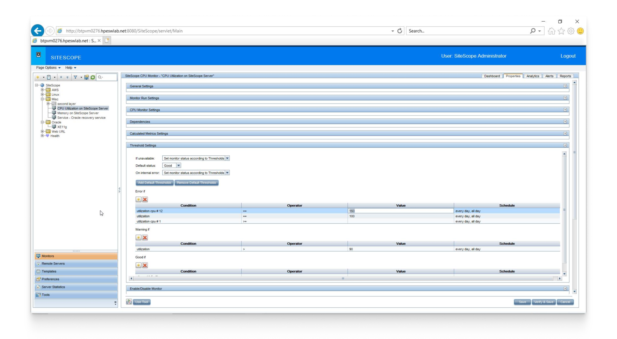
SiteScope’s UI had not been meaningfully updated since the late 1990s and no longer met modern interaction expectations. The product also predated the organization’s current design system, resulting in inconsistent patterns, outdated visuals, and increased cognitive load
In parallel, customers and internal users were actively demanding UX and UI improvements, citing usability friction and outdated workflows as barriers to effective monitoring. Several enterprise clients indicated that continued lack of modernization would factor into renewal and contract decisions, elevating UX from a design concern to a clear business risk.
The challenge was to deliver a meaningful modernization of SiteScope within an aggressive timeline, balancing urgent customer expectations with the complexity of enterprise-scale monitoring.
Approach
Early in the project, it was clear that meaningful modernization required a deep understanding of how customers actually used SiteScope day to day. Rather than designing from assumptions, I began by using the product extensively myself, configuring monitors, navigating alerts, and troubleshooting failures to experience the same friction our customers faced.
I partnered with Product, Engineering, and UX leadership to document priorities and success criteria under a tight timeline, then mapped critical monitoring workflows to focus design efforts on reducing cognitive load and improving system visibility.
The primary users of Monitoring Control Center were enterprise IT professionals responsible for maintaining system health and reliability at scale. This included Systems Administrators, who needed immediate, accurate insight when issues occurred, and IT Operations Managers, who required confidence in monitoring coverage, trends, and system reliability to report to leadership. Both personas depended on fast visibility, consistent behavior, and clear signals to make high-stakes decisions without friction.
Improvements
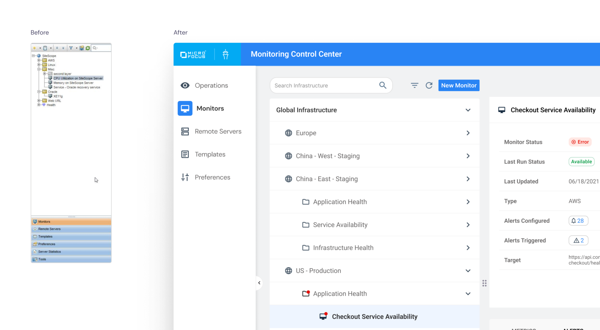
Navigation
The original navigation was built around single-server instances and nested within the monitoring structure. This backend-driven placement was unconventional, reduced discoverability, and relied on unclear labels and icons. Users struggled to quickly find monitors, groups, and system views.
The navigation was restructured around user workflows rather than server constraints. Clear hierarchy, improved labeling, and familiar design patterns made it easier to move between critical views. This improved discoverability and supported a scalable, unified monitoring experience.
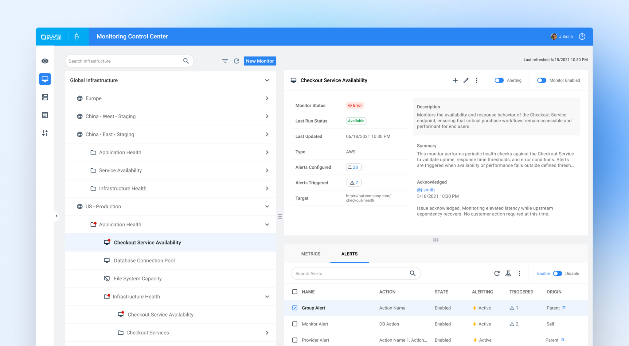
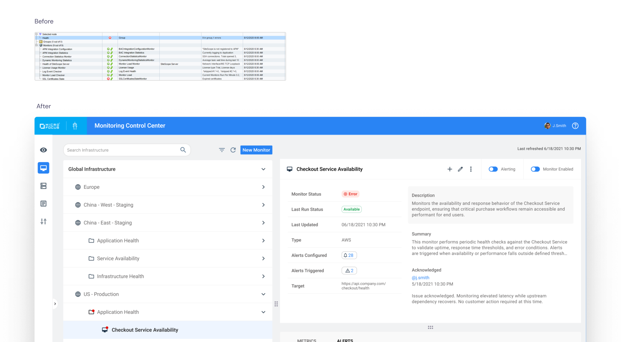
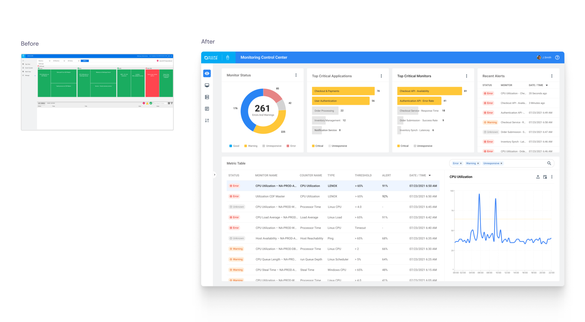
Monitoring Health
Before: System Health duplicated the infrastructure tree and grouped monitor status, child elements, and metrics together in a single view. Key summaries were buried within form elements, making it difficult to quickly assess overall performance. Users could not determine monitor health at a glance.
After: System Health was redesigned to surface clear, at-a-glance status across monitors, groups, and services. Previously fragmented signals were consolidated into distinct health indicators, allowing administrators to quickly understand state, risk, and impact without navigating into edit modes. Metrics and alerts were separated from the overview to create clearer hierarchy and reduce cognitive load.
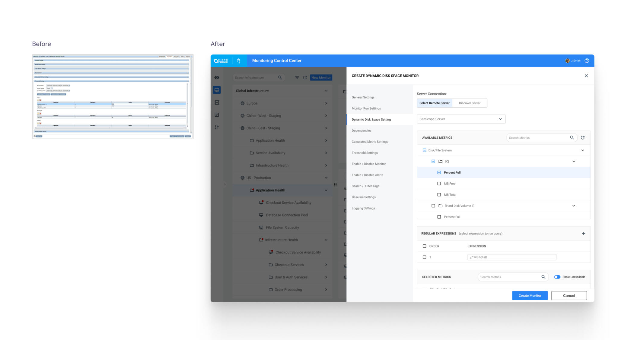
Monitor creation and editing
Before: Monitor creation and editing shared the same default view, allowing users to read and modify settings simultaneously. This blurred workflow intent and increased cognitive load.
After: Monitor workflows were systemized with consistent layout, validation, and interaction patterns. View and create/edit modes were separated, clarifying intent, reducing cognitive load, and making the architecture easier to manage with permissions.
Operational Dashboards
Before: Operational dashboards were limited to single SiteScope instances and displayed monitor group status through a static tree view. Users lacked cross-instance visibility and had no way to analyze trends or share insights across teams.
After: Dashboards were redesigned to provide unified visibility across all SiteScope instances. Users could filter by instance, server, group, or monitor and view real-time status alongside historical trend charts to anticipate issues. Views could also be exported and shared, improving cross-team awareness and operational transparency.
8/8
contracts retained as customers cited the MCC redesign as a key factor in renewal decisions.
100%
user preference for the redesigned MCC experience over the legacy SiteScope UI in comparative testing
60%
Reduction in monitor creation time through standardized forms, clearer defaults, and systemized interaction patterns
1
unified monitoring UI replaced the previous one-instance-per-interface model across all SiteScope environments
Results and Impact
Monitoring Control Center (MCC) modernized SiteScope, transforming a legacy, single-instance monitoring tool into a scalable, unified enterprise platform. As Lead UX Designer, I restructured navigation, clarified system health visibility, systemized monitor workflows, and introduced cross-instance dashboards—reducing cognitive load and improving operational efficiency across complex environments.
Learnings
- Working directly with enterprise clients reduced guesswork and exposed real-world complexity at scale
- Replacing legacy systems at enterprise scale introduces significant operational and technical complexity